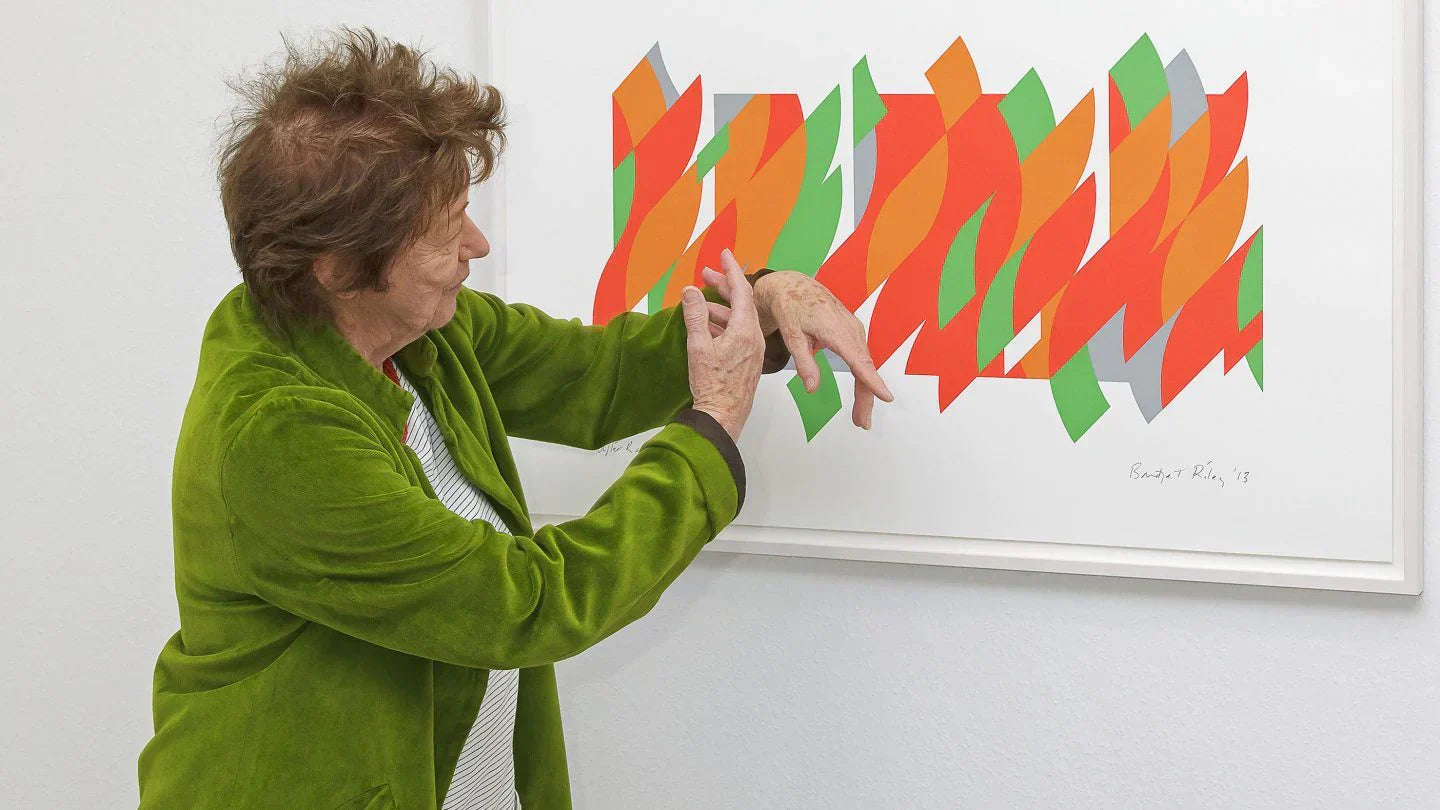
Bridget Riley demonstrating the movement in 'After Rajasthan' (2013) at the opening of the exhibition Bridget Riley – Prints, Städtische Galerie, Villingen-Schwenningen, 2013.
Bridget Riley’s prints
Robert Kudielka
Almost all of Bridget Riley’s prints are executed in the silkscreen technique. The only exceptions so far are prints related to the series of wall drawings Composition with Circles, which because of the tenuous linear imagery led to the employment of a high resolution inkjet technology called ‘giclée’. Both processes exclude the interference of personal handling. Riley prefers this detachment not because of the objective look of the result; her aim is rather the direct, undistracted rapport with the spectator. For the same reason, the final versions of her paintings have been executed by assistants ever since she started her abstract black-and-white work in 1960–61. ‘I wanted the actual content of the paintings to come through unchecked by any kind of touch, so that you could see the strength or weakness of something without any barrier.’
In one important aspect, however, Riley’s prints differ from her paintings. Even if they are related to existing works, they are not just reproductions in small format, their scale is attuned to the regard of the spectator. No painting of Bridget Riley can be reduced in size without weakening or hampering its character because, in each case, its particular elements, their mutual relationships and the overall format are chosen in relation to the physical distance of perception. Her prints, on the other hand, call on a different visual attention: the spectator acts almost like a ‘reader’ who envisages the work in a more intimate space framed by the white border of the sheet of paper. The pictorial factors therefore have to be modified accordingly. Obvious examples for this are the images based on the ground-breaking paintings Movement in Squares (1961) and Blaze (1962). In both prints – Untitled, 1962 and 1964 – the scale of the images has been adjusted to achieve the intended likeness.

Bridget Riley beside 'One Small Step' (2009) at the opening of the exhibition Bridget Riley – Prints, Städtische Galerie, Villingen-Schwenningen, 2013.
But the translation of a painted image into a print is not standard practice. Only the prints related to the recent wall drawings and paintings – the series Composition with Circles (1998–2011), the Arcadia group (2010–13) and After Rajasthan (2013) – are more or less reproducing the image of the preparatory designs on which these works were based. For obvious reasons any attempt at what Riley has called ‘perceptual equation’ would have been futile. The wall-work prints act as harbingers or mementos of the actual experience. This function is quite different from the stature of those prints that stand on their own. Although also drawn from the copious stock of studies preceding Riley’s paintings, the independent prints exhibit particular aspects or stages arising in the gradual development from the première pensée on a small sheet of paper via extensive studies of details and compositional structures right up to the full-scale cartoons for a painting. During this preparation constellations may emerge that deserve attention for their own sake: some because they are of principal interest beyond their ad hoc function, others are variables encompassing a wider potential; and sometimes a surprisingly complete image may come up that defies further elaboration. Each of these instances can be an incentive for making a print. For instance, the title Fragments (1965) explicitly indicates that this group of various formations, printed on the reverse of Plexiglas sheets, reveals basic aspects of Riley’s early black-and-white work: structural compression and expansion, successive formal progressions, axial changes of direction, optical resonance effects. In a similar way the series titled Elongated Triangles (1971) reveals through the concentration on two or three coloured stripes the potential of chromatic interaction that marked the beginning of her involvement with pure colour. On another level, the triplets Green, Blue, Red Dominance (1977) and Untitled [Blue], [Bronze], [Rose] (1978) display the genuinely musical method of varying colour harmonies by shifting the keynote. And finally, individual images such as Fête (1989), Carnival (2000), Two Blues (2003), About Lilac (2007) or the three Bagatelle prints (2015) show an increasing tendency in later years to make a place for studies that appear to have attained a state of ‘completeness’.
In this way Riley’s prints reflect her development as painter over the last 50 years by providing intermittent insights into the explorations and compositional ventures on the way to a painting. Printmaking has been an occasional activity, rather than a continuous concern of her work. Although in the last 20 years she increasingly took control over this output, the majority of her prints has been occasioned by external demands. Apart from print editions being commissioned by galleries or art clubs, they often were prompted by the need to help public institutions in offsetting the costs encountered by the special requirements of installing her work; and some of them were straightforward donations to charitable projects. This may explain the time lag between the chronological origin of some images and their execution in print, as for instance in the case of Elapse (1982) or the Serpentine Print (1999). But this in no way undermines the creative value of Riley’s printmaking. It only draws attention to the fact that in her case chronology alone is not an appropriate criterion. ‘All my work is one thing, as it were,’ she wrote in 1978, ‘it may appear different but it is essentially the same.’ Reconnecting with earlier stages of her work is part of her way of pushing ahead.

Installation view of Bridget Riley – Prints, Städtische Galerie, Villingen-Schwenningen, 2013.
In view of the consistency of Riley’s development as painter, the loose but steady trickle of her prints offers the chance of momentary glimpses into the tension between the dynamism of her medium and its formal articulation, which she regards as being essential to her work: ‘It is not a one-way relationship of taming the wild, but can also be the reverse. I am supported by the medium but at the risk of being overwhelmed by it – the medium both carries you and threatens to carry you away.’ In this context the absence of paintings related to a print motif is as telling as the opposite – the lack of prints during a strong passage of painting. For instance, in the late 1960s Riley explored the chromatic relationships of orange, violet and green coloured greys in curvilinear formations, horizontal and vertical. The subtle fluctuation of the subdued colours created a soft, almost velvety visual field; but the tonal pitch seemed to be too low and the greyed hues tonally too closely linked to develop this subtle sensation into a painting. Interestingly, 50 years later a similar colour bracket of low-keyed orange, violet and green, reappeared in a new group of paintings and prints titled Intervals (2019). Although the early curvilinear studies seemed to work only on an intimate scale they eventually led to three prints titled Coloured Greys (1972), one of which won the Ohara Art Museum prize at The 8th International Biennial Exhibition of Prints, held in Tokyo and Kyoto in 1972–73.
The reverse decision, that a pictorial theme is not suitable for being rephrased in the print medium, occurs as well. In 1986 Riley started on a series of paintings with highly complex rhomboid structures that were to occupy her pictorial interests for more than ten years. There are, however, only two large prints, Early Light (1987) and To Midsummer (1989), which reflect the pictorial preoccupations of this period, although in an early, formative stage. As work in this group continued, the formal breakdown, combined with a steadily increasing palette, produced vigorous curvilinear colour movements incompatible with the limited scale of a print. Nevertheless, en route to these pictorial events there were preliminary stages that disclose the underlying vertical metre carrying solid blocks of colour. The perfect poise of these studies lent itself to two independent prints, Fête (1989) and June (1992/2002).
But just at the point when one thinks that one has grasped the criterion governing Riley’s judgement in printmaking – its limited capacity to unleash and contain the visual forces essential to her work – this rationale is turned upside down. Towards the end of her work with rhomboids, around 1997, she started to introduce a curvilinear element into these dense structures. It took her two years to bring about this transformation. The preliminary studies disclose a slow, exacting progress: first, only a one-sided crescent shape was introduced, accompanied by a considerable reduction of colours – and then she risked the full swing of the pendulum… The result was dramatic: a fast, almost uncontrollable rhythm broke out that barred any further development. To slow this down, Riley enlarged the size and volume of the structure in the subsequent curvilinear paintings. But the prints Echo (1998), Sylvan (2000) and Carnival (2000) show that in small portions a certain amount of the wild can be quite enjoyable.
Extract of essay ‘Bridget Riley’s Prints’ by Robert Kudielka, from Bridget Riley: The Complete Prints.